Traffic flow maps

A tweet by artist, designer and developer Jill Hubley drew my attention to a traffic flow map of London, created by Bauhaus architect Ludwig Karl Hilberseimer. The map shows the number of buses passing through London’s central arteries in one hour. «The traffic diagram of London shows both the typical congestion in the center and the lack of transportation facilities at outlying points,» he commented. Hilberseimer thought the solution to this transportation problem was to decentralise the city, by creating satellite cities with a population of at most 100,000.
Hubley has been tweeting numerous historical traffic flow maps, including a beautiful 1944 map showing transport along the waterways of Belgium and the Netherlands. What struck me about the Hilberseimer map is its similarity to a series of maps in a traffic study published by the city of Amsterdam in 1976. These maps were discovered by Marjolein de Lange of cyclists’ organisation Fietsersbond, and have been reproduced in the book Bike City Amsterdam she wrote with Fred Feddes.

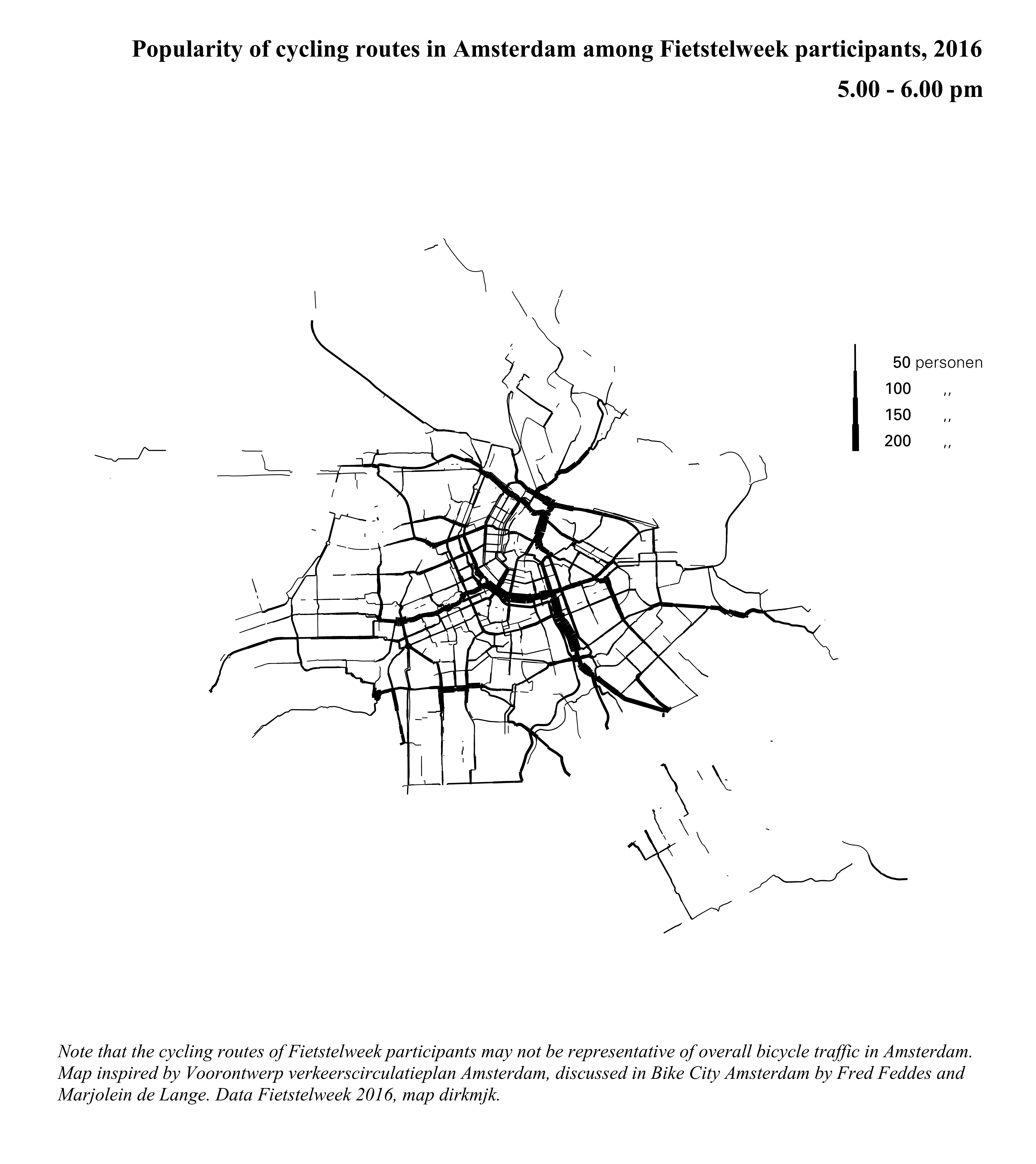
The Amsterdam maps illustrate how cycling had declined in Amsterdam between 1961 and 1971, and how rising car use had created a congestion problem. It wasn’t until later that the city developed measures to promote cycling, as analysed in Bike City Amsterdam. I tried to create a 2016 version of the cycling map using Fietstelweek data, but it should be noted that the cycling routes of Fietstelweek participants may not be representative of overall bicycle traffic in Amsterdam.
Compared to Hilberseimer’s map, the maps created by the city of Amsterdam have a very clean design: all cartographic details that do not represent traffic data have been omitted. And then there’s the elegant legend. Hubley has tweeted a Swedish traffic flow map from 1977 with a similar type of legend, as well as a map of Florida from 1952, a map of St. Paul - Minneapolis from 1949, and a 1945 map of eastern Germany with a horizontal version of the legend. (Update - interesting variant on this 1963 Lincolnton map; plus see this 1921 map of Seattle.) I wonder whether earlier examples exist. Also note this different approach to the legend - quite elegant as well.
Were the flow maps in Amsterdam’s traffic circulation plan inspired by Hilberseimer’s Traffic Diagram of London? Possibly, but Hilberseimer wasn’t the first to create a traffic flow map. In fact, both Amsterdam’s map makers and Hilberseimer are indebted to a map created a century before Hilberseimer’s map, by the French civil engineer Charles-Joseph Minard.

In her book The Minard System, visualisation strategist Sandra Rendgen comments:
In this revolutionary map, created in the middle of a debate about where to project the railroads between Dijon and Mulhouse in eastern France, Minard analyzed the street traffic on preexisting roads in the region.
Apparently, the map was so influential in shaping the debate that a fake copy was made ‘in an attempt to prove another route to be more promising’.
Rendgen describes how Minard initially created bar charts to represent traffic along segments of a route. At some point, he decided to project these graphs onto a map, which resulted in the creation of the flow map. Over time, Minard’s flow maps gained in complexity, as he used colour to represent different types of data. Minard is sometimes credited with inventing the flow map, but Rendgen points out that the design was possibly invented more or less simultaneously in Ireland, France and Belgium.
Minard’s charts and maps often contain detailed descriptions of the data and methods he used. He collected data from a range of sources, and emphasised that graphs should accurately represent the data. On the other hand, he was willing to sacrifice geographic detail or accuracy for clarity. Rendgen points to the ‘clean and minimalist aesthetics’ of his work, devoid of decorations or other clutter. It is no wonder that Edward Tufte, the renowned proponent of clutter-free data visualisation, described Minard’s work as an example of ‘graphical excellence’ (in The Visual Display of Quantitative Information).
A recurrent theme in Minard’s explanatory notes is that he aimed to make relationships quickly apparent to the eye. One of these notes has an almost futurist sense of modernity to it: «The figurative maps are thoroughly in the spirit of the century in which one seeks to save time in all ways possible.»
One could argue that the 1976 Amsterdam traffic flow maps are true heirs to Minard’s approach, and especially to his first, monochrome flow map reproduced above. As Rendgen notes, Minard’s map is «extremely stripped down; it features barely any landscape details other than a network of local place names and rivers». Even those subtle geographical hints have been omitted from the Amsterdam traffic flow maps. Of course, this only works because of the very recognisable pattern of Amsterdam’s streets.